
Button
Add a Button field in Infinite Options so shoppers pick one or several choices from clickable buttons instead of a dropdown or radio list.
A Button field shows choices as clickable buttons instead of a dropdown or radio list. It supports both single and multiple selections.
Step 1: Add a Button Field
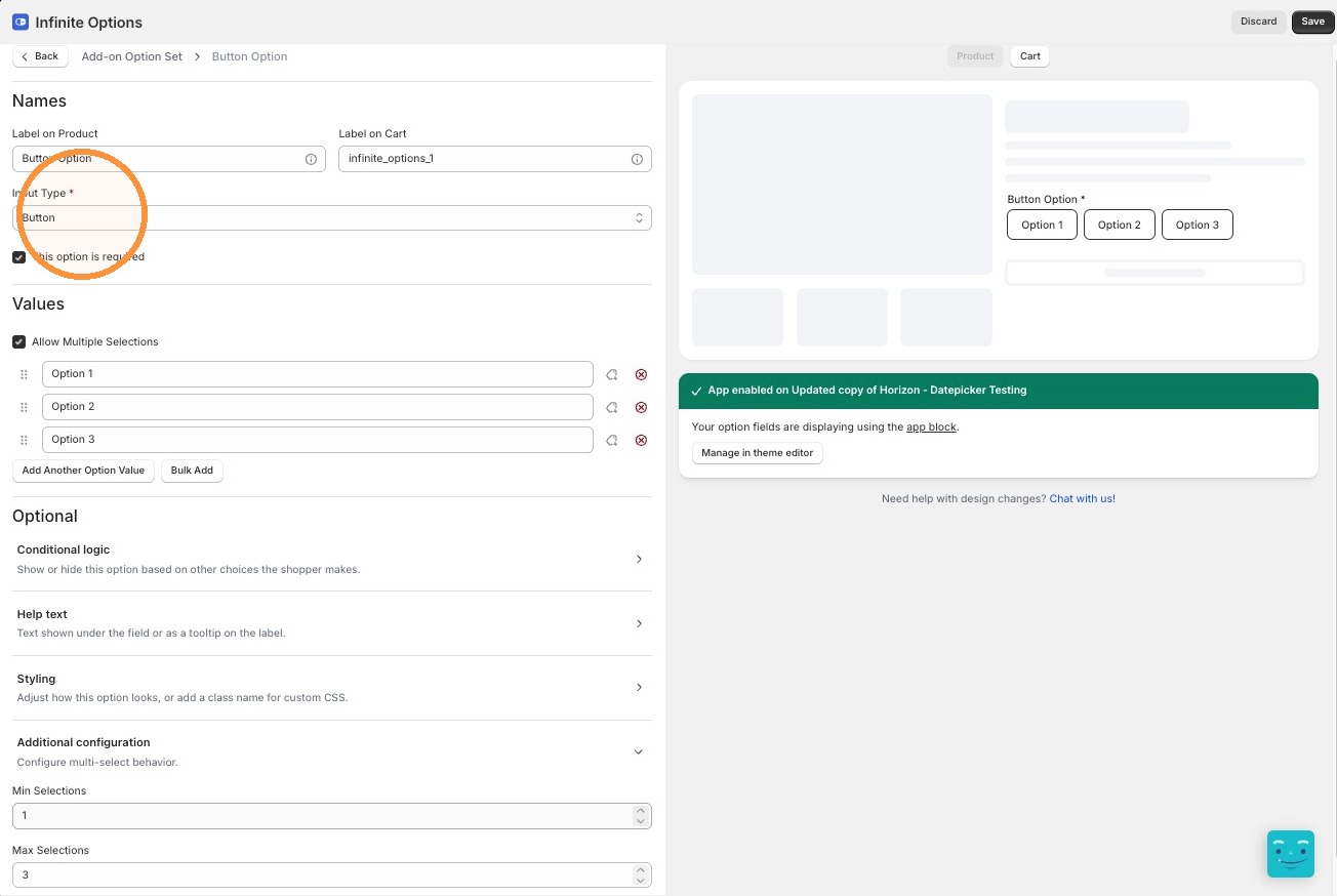
Section titled “Step 1: Add a Button Field”Open an existing Option Set or create a new one. Add a new option and select Button as the input type.
Step 2: Add Your Option Values
Section titled “Step 2: Add Your Option Values”Enter the values customers will choose from.
Step 3: Choose Single or Multiple Selection
Section titled “Step 3: Choose Single or Multiple Selection”By default, Button is single-select, and Required is forced on since a shopper always needs to pick one. To allow more than one choice, turn on Allow Multiple Selections under Additional configuration. This reveals Min Selections and Max Selections, and the field behaves like a set of checkboxes. Required is optional for multi-select.
Step 4: Style the Buttons
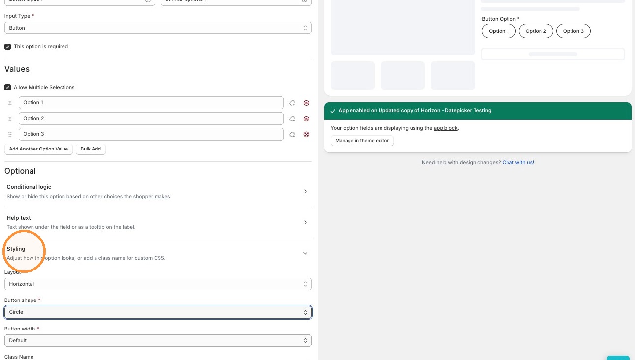
Section titled “Step 4: Style the Buttons”Under Styling, choose a Layout (Horizontal or Vertical), a Button shape (Square, Rounded, or Circle), and a Button width (Fit label, or a fixed 25/33/50/66/75/100%). Optionally add a Class name for custom CSS.
Step 5: Save Your Option Set
Section titled “Step 5: Save Your Option Set”Click Save to save your changes.