
Add a date picker to your store
Add a date picker or calendar to your Shopify store with the Infinite Options Date Picker input type, or a custom method for more control.
Follow the steps below to add a date picker or calendar to your store.
Before you get started
Section titled “Before you get started”There are two ways to add a date picker. The best option depends on how much customization you need.
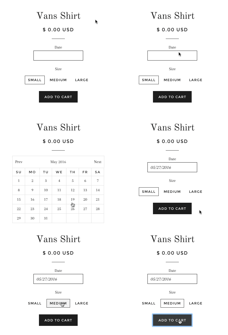
Method 1: Date Picker input type: Select the Date Picker input type directly in Infinite Options. This is the quickest setup option and does not require adding any code. The calendar design will use the browser’s built-in date picker.
Method 2: Custom date picker calendar: Add a snippet of code and CSS to your theme to create a custom calendar. This option requires editing your theme code, but provides more control over the calendar’s appearance and styling
Method 1: Use the Date Picker Input Type
Section titled “Method 1: Use the Date Picker Input Type”- Open the Infinite Options app.
- Create a new option or edit an existing option.
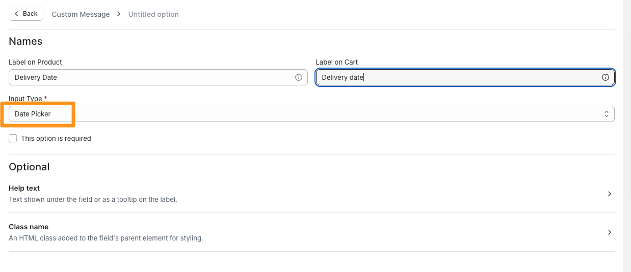
- Set the Input Type to Date Picker.
Your date picker field will now display using the browser’s built-in calendar
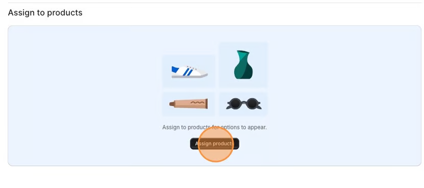
- Assign to products
- Save your changes.
Method 2: Add a Custom Date Picker Calendar
Section titled “Method 2: Add a Custom Date Picker Calendar”This method adds a custom calendar using additional scripts and CSS.
Add the Date Picker Script to Your Theme
Section titled “Add the Date Picker Script to Your Theme”- From your Shopify admin, go to Online Store > Themes.
- Click … > Edit code on your current theme.
- Under the Layout folder, open the theme.liquid file.
- Search for the closing head tag:
</head>- Copy the script below and paste it directly before the closing
</head>tag. - Click Save.
<script>  window.Shoppad = window.Shoppad || {},  window.Shoppad.apps = window.Shoppad.apps || {},  window.Shoppad.apps.infiniteoptions = {    ready: function() {
      function callback() {        var jQ = window.$ && window.$().datepicker ? window.$ : window.Shoppad.$;
        jQ('#infiniteoptions-container .datepicker').datepicker({          inline: true,          altField: '#infiniteoptions-container .datepicker input[type=text]',          onSelect: function() {            jQ('#infiniteoptions-container .ui-datepicker-inline').hide();      var inputEvent = new Event('input', {                bubbles: true            });            jQ('#infiniteoptions-container .datepicker input[type=text]')[0].dispatchEvent(inputEvent);          }        });
        jQ('#infiniteoptions-container .datepicker input[type=text]').change(function(){          jQ('#infiniteoptions-container .datepicker').datepicker('setDate', $(this).val());        });
        jQ('#infiniteoptions-container .datepicker').datepicker( "setDate", '' );
        jQ('#infiniteoptions-container .datepicker input[type=text]').attr('readonly','true');
        jQ('#infiniteoptions-container .datepicker input[type=text]').addClass('notranslate');        jQ('#infiniteoptions-container .datepicker input[type=text]').attr('translate', 'no');
        jQ('#infiniteoptions-container .ui-datepicker-inline').hide();
        jQ('#infiniteoptions-container .datepicker input[type=text]').on('click touchstart', function (e) {          jQ('#infiniteoptions-container .ui-datepicker-inline').show();        });
        jQ(document).on('mouseup touchstart', function(e) {          var isDatePickerInput = jQ('#infiniteoptions-container .datepicker input').is(e.target);          var isDatePicker = jQ('#infiniteoptions-container .ui-datepicker-inline').is(e.target);          var isChildOfDatePicker = jQ('#infiniteoptions-container .ui-datepicker-inline').has(e.target).length;
          // If the target of the click isn't the text input, the date picker, or a descendant of the date picker          if (!isDatePickerInput && !isDatePicker && !isChildOfDatePicker) {            jQ('#infiniteoptions-container .ui-datepicker-inline').hide();          }        });      }
      if (window.jQuery && window.jQuery.fn && window.jQuery.fn.datepicker) {        callback();      } else {        // Set jQuery on page        window.jQuery = window.jQuery || window.Shoppad.$;        var script = document.createElement('script');        script.src = '//code.jquery.com/ui/1.10.2/jquery-ui.js';        script.onload = callback;        document.getElementsByTagName('head')[0].appendChild(script);      }    }  };</script>
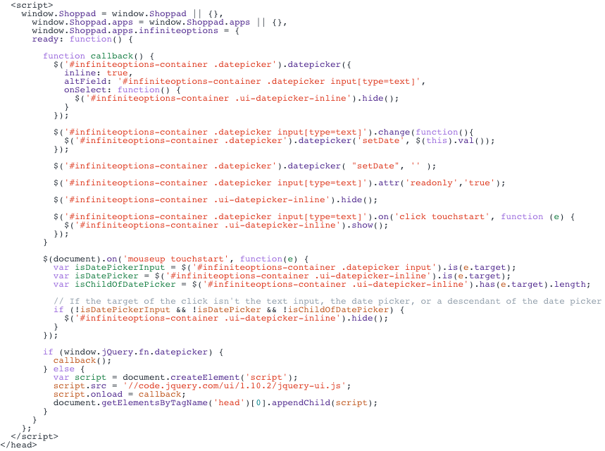
Here is how the code snippet will look pasted into the theme file:
Add CSS Styles
Section titled “Add CSS Styles”Next, add the CSS that controls the appearance of the custom calendar.
- Open the Infinite Options app.
- Select Settings from the left sidebar.
- Locate the Custom CSS section.
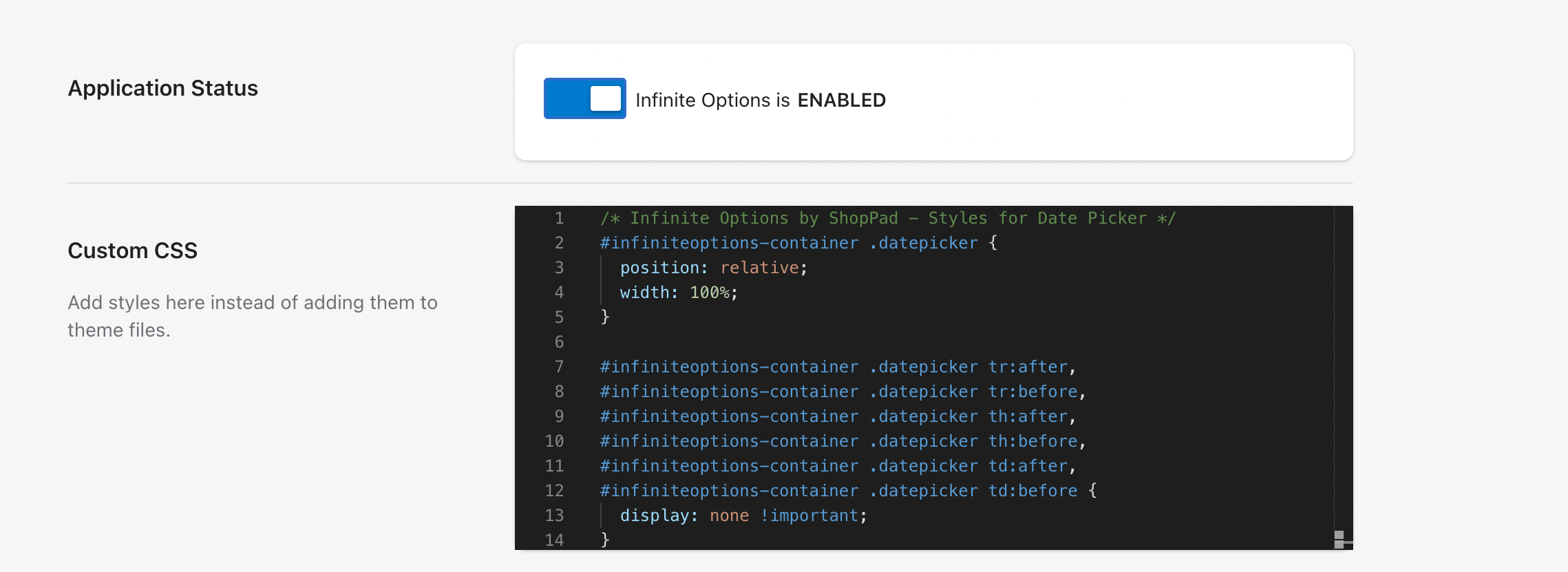
- Copy the CSS snippet below and paste it below any existing CSS.
/* Infinite Options by ShopPad - Styles for Date Picker */#infiniteoptions-container .datepicker {  position: relative;  width: 100%;}
#infiniteoptions-container .datepicker tr:after,#infiniteoptions-container .datepicker tr:before,#infiniteoptions-container .datepicker th:after,#infiniteoptions-container .datepicker th:before,#infiniteoptions-container .datepicker td:after,#infiniteoptions-container .datepicker td:before {  display: none !important;}
#infiniteoptions-container .ui-datepicker-inline {  margin: 0;  padding-top: 0;  background-color: #fff;  color: #333;  position: absolute;  top: 0;  right: 0;  left: 0;  z-index: 1000;}
#infiniteoptions-container .ui-datepicker-calendar {  margin: 0;  padding: 0;  width: 100%;  border-collapse: collapse;  border-spacing: 0;}
#infiniteoptions-container .ui-datepicker-calendar td,#infiniteoptions-container .ui-datepicker-calendar th {  cursor: pointer;  text-align: center !important;  padding: 5px !important;  height: 10px !important;  width: 10px !important;  background-color: #fff;  border: 1px solid #ddd;}
#infiniteoptions-container .ui-datepicker-header {  border: 1px solid #ddd;  border-bottom: 0;}
#infiniteoptions-container .ui-datepicker-title {  text-align: center;  padding: 10px;}
#infiniteoptions-container .ui-datepicker-prev {  float: left;  padding: 10px;}
#infiniteoptions-container .ui-datepicker-next {  float: right;  padding: 10px;}
#infiniteoptions-container .ui-icon {  cursor: pointer;}
#infiniteoptions-container .ui-state-disabled { opacity: .5;}- Click Save.
Create a text option then add a class name
Section titled “Create a text option then add a class name” 1. You will want to use a text field as the inpute type:
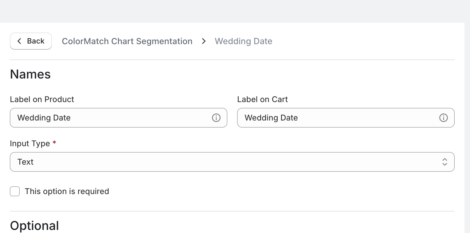
- Then scroll down to the Class name field and add “datepicker” as a class name.
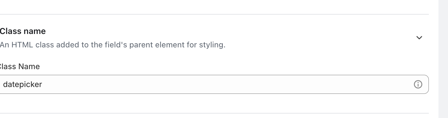
Your custom date picker calendar is now ready.
For additional customization options, check out our date picker customization guide.