
Create Custom Options
Build your first Infinite Options Option Set, add fields from the input type picker, and assign it to the products where it should show.
https://www.youtube-nocookie.com/embed/hnUn2TG6V6Y?rel=0
If you want customers to add a name, pick a color, choose a date, or make any kind of custom selection on your product page, you’re in the right place.
This guide walks you through setting up your first Option Set from start to finish.
- Creating an option set
- Adding and configuring option fields
- Assigning them to display on products
Step 1: Create a New Option Set
Section titled “Step 1: Create a New Option Set”- From the Infinite Options dashboard, click Create Option Set
- Give your Option Set a name
An Option Set is a group of custom fields that appear together on a product page. For example, you might have one Option Set that includes a text field for engraving and a dropdown for gift wrapping.

Step 2: Add Your First Option
Section titled “Step 2: Add Your First Option”Click Add my first option. A picker will appear with all available input types.
Input Types
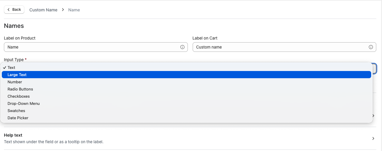
| Input type | What it does |
|---|---|
| Text field | Customer types freely. Best for short responses like a name or monogram. |
| Large text | Multi-line text entry. Good for longer instructions or notes. |
| Number | Customer enters a number. The field only accepts numeric characters. |
| Radio options | Single selection. Always pre-selects the first value. If you need customers to make an active choice, use a dropdown with a placeholder instead. |
| Checkbox | Allows one or more selections. |
| Drop-down menu | Single selection. Add a placeholder to prompt customers to choose before adding to cart. |
| Swatch | Color or image selection. The first value is pre-selected by default. You can configure the field to allow multiple selections |
| Date picker | The customer selects a date using a calendar input. |
| Upload | The customer attaches a single file, up to 4MB. Files are kept for 30 days. |
| Header | Adds a heading and optional description to break up a long Option Set. Doesn’t collect an answer and never submits to the cart. |
| Switch | A single on/off toggle, good for a simple yes/no add-on. |
| Button | Choices shown as buttons instead of a list. Supports single or multiple selection. |
| Dropdown with Images | A visual swatch-style picker that shows in a dropdown menu. |
| Font Selector | Customer chooses from a list of fonts you select, shown in their own typeface. |
Step 3: Configure Your Option
Section titled “Step 3: Configure Your Option”After selecting an input type, you’ll land in the option editor.
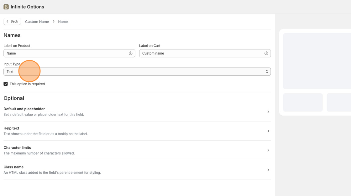
Names
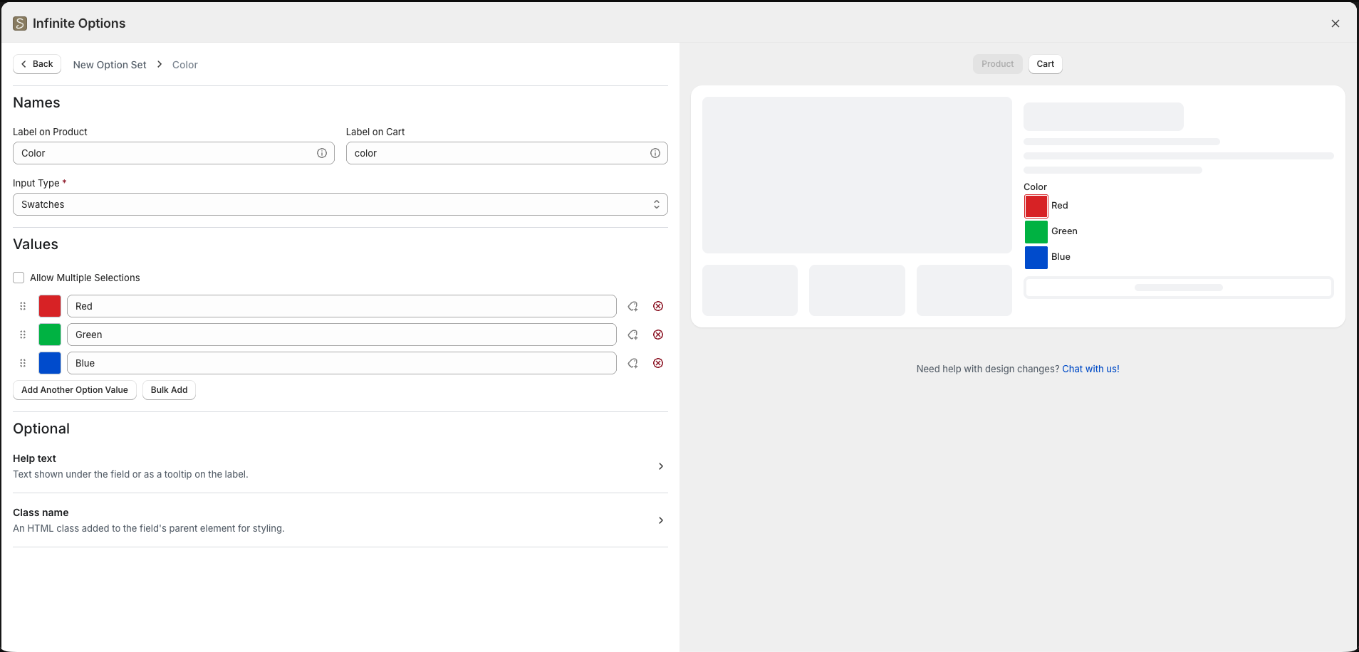
Label on Product is the text that appears above the field on the product page.
Label on Cart is the text that appears in the cart, at checkout, and on the order. You can keep it the same as the product label or shorten it for order management purposes.
Required
Check This option is required if the shopper must fill in or select a value before adding to the cart.
Preview
Section titled “Preview”As you configure your option, the preview pane on the right updates live. Use the Product and Cart toggles to see how the option appears in both places.
Step 4: Adjust Optional Settings
Section titled “Step 4: Adjust Optional Settings”These settings appear under the Optional section of the editor. Not all settings are available for every input type.
Default and placeholder
- Default Value – Pre-fills the field when the page loads. The customer can change it before adding to cart.
- Placeholder Text – Hint text shown inside an empty field. It disappears when the customer starts typing. Only the customer’s actual input gets saved to the order.
- Allowed numbers (Number options only): Choose Whole numbers only or Whole and decimal numbers.
- Adjust Min and Max number values as well.
Conditional logic
When a customer makes a selection, the right follow-up options appear automatically, and anything that doesn’t apply stays out of the way. See our guide on conditional logic for more info.
Help text
Additional guidance shown to the shopper. Display it as a Tooltip (an info icon next to the label) or Inline (text shown below the field).
Character limits
Sets the maximum number of characters a customer can enter. Useful for engraving or monogram fields with a physical limit.
If your option has selectable values such as a dropdown, radio buttons, checkboxes, or swatches, you can add a price to any individual value by clicking the Add price next to it. See Add pricing to your options for details.
Step 5: Add More Options
Section titled “Step 5: Add More Options”When you’re done configuring an option, click Back to return to the Option Set. To add another option, click Add Option in the top right corner of the Options section.
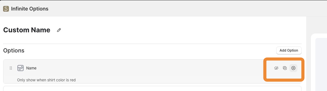
Each option row has three icons on the right:
- Eye icon – Set rules for when this option shows or hides based on other selections. By default, all options are set to always show. See Conditional Logic for more.
- Copy icon – Duplicates the option
- X icon – Deletes the option
Step 6: Assign to Products
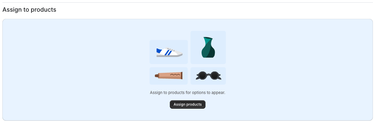
Section titled “Step 6: Assign to Products”In the Assign to products section, select which products this Option Set should appear on. You can assign by: Tag, Vendor, Type, URL, Handle, or All Products.
https://www.youtube-nocookie.com/embed/jU2N2OdVGYs?rel=0
Step 7: Save
Section titled “Step 7: Save”Click Save. Your options may take a few minutes to appear on your storefront.
Not Seeing Your Options?
Section titled “Not Seeing Your Options?”If your options don’t appear on the product page:
- Confirm the Option Set is saved
- Check that it’s assigned to the correct product
- Make sure the Infinite Options app block is installed on your theme
If you need help with enabled Infinite Options: [Turn on Infinite Options for Your Theme]